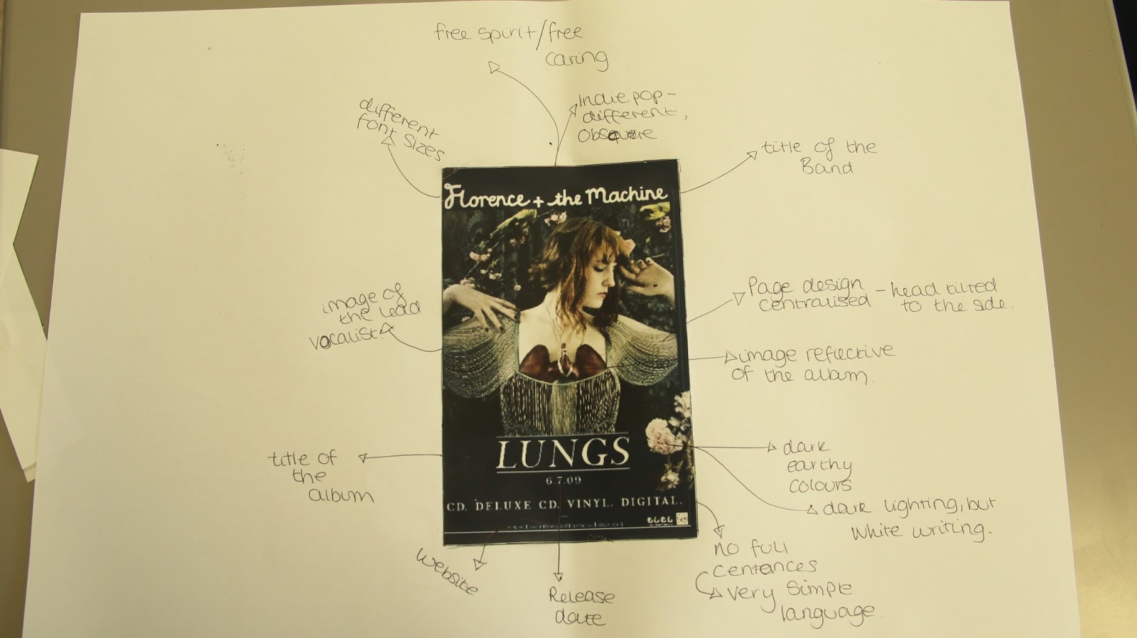
We have done some magazine research to find the common conventions of music magazine adverts. In my advert for Florence and the machine most conventions are there. I found it interesting that they have used dark earthy colours with a white font style for the text. The layout is very central and does not use the rule of thirds.
It does not include the record label and has simple text, so the viewer can understand.
No comments:
Post a Comment