Sunday, 17 January 2016
Interim evaluation 2
For the CD Digipack we wanted this to reflect not only our music video, but the lyrics within our song. From floating around a range of different names, we decided to use 'blurred motions' as this reflecting the single 'Count The Days' as well as continuing with the theme of going through the motions. Originally we wanted to use a single blurred image of the artist, with a dream like filter over the top. However this seemed too simple and did not resemble going through the motions. As Claire was in charge of the digipack I sat with her and went through the music video to find inspiration from some of the shots we have used. This way the digipack/album cover reflects the work we have done on the editing of the piece as well as promoting the artist and song.
Sunday, 10 January 2016
Audience feedback on social media for our music video
When I uploaded our music video link onto Twitter, we received some audience feedback quickly. I agree with the first comment to an extent, however, I think we could have done more in the sense of costume, with a variety of styles that we could have included. But, we did manage to include aspects of the idea that "things could be worse" with the mentioning of drugs, which shows that we were linking the lyrics of the song to the visuals.
Saturday, 9 January 2016
Back cover of our digipak
Friday, 8 January 2016
Photos of work in progress for Magazine Ad
For our magazine ad, we thought it would be a good idea to incorporate our Digipak in the ad. By having the artist sitting next to the frame, we decided it would emphasise the 'dreamy' effect that we have carried through our music video. Once we have finished the Digipak, we will add in the front cover into the wooden frame in the picture shown using Photoshop.
Thursday, 7 January 2016
Magazine design
Album Cover Art
 |
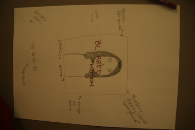
| I have placed the artist in the centre of the cover, so that the focus is on her. This image of her will then be blurred, reflecting on the title of the album. |
 |
| On the left insdide side of the cover I have written acknowledgements. From my own research I know this is usually a thanks for the people who have helped make the album. In the bottom right of the |
Magazine advert
This is my idea for the magazine advert. I would have the artist in the centre of the shot with the name of the album above her. The title of the album would be a different font and size to the name of the artist which I have put in the centre of the page, at the bottom. Underneath the name of the artist I would ahve the release date as well as reviews either side of the artist. Linking in with the theme of the CD Digipack I have used a blue tint over the artist to make it look like she is in a daze. As well as this I would add a blur effect on the artist to link with the name of the album.
Subscribe to:
Posts (Atom)


